Wild Forms
Wild Forms
Wild Forms: A nature-based toy brand
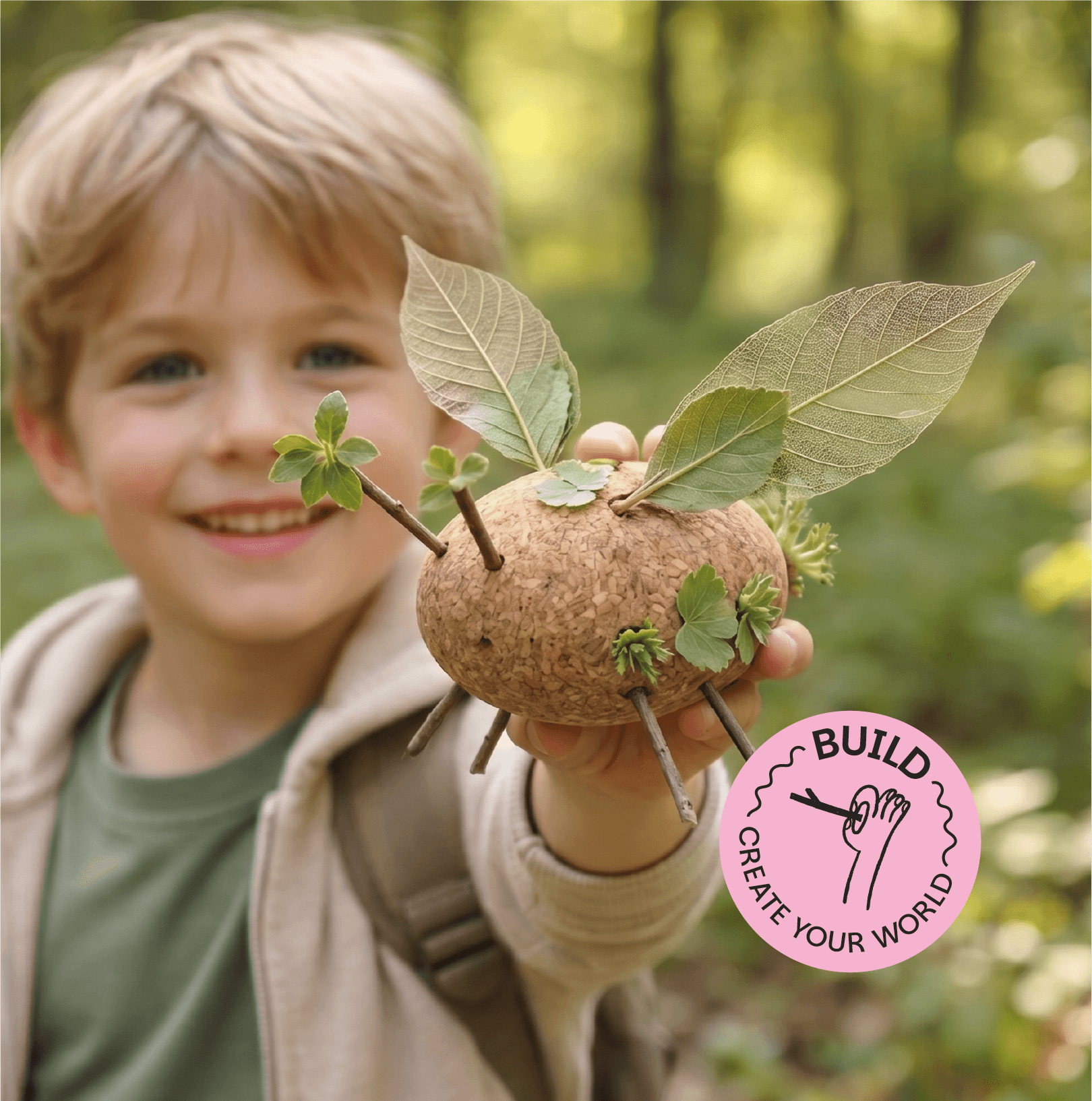
Wild Forms began with a personal observation, that children today engage with nature in ways that are increasingly passive, limited, and structured. The project sets out to change that by making nature an active part of play. Children carry their Wild Forms cork blocks outdoors, then explore and collect whatever they find - leaves, twigs, flowers, pinecones, inserting them into the blocks' cavities to build their own creatures, structures, and worlds. The result is a play experience that is exploratory, creative, and entirely unscripted.
Category
Product Development
Brand Identity
Packaging Design
Website Design
Year
2026
Wild Forms began with a personal observation, that children today engage with nature in ways that are increasingly passive, limited, and structured. The project sets out to change that by making nature an active part of play. Children carry their Wild Forms cork blocks outdoors, then explore and collect whatever they find - leaves, twigs, flowers, pinecones, inserting them into the blocks' cavities to build their own creatures, structures, and worlds. The result is a play experience that is exploratory, creative, and entirely unscripted.
Category
Product Development
Brand Identity
Packaging Design
Website Design
Year
2026

Through primary and secondary research, I explored how children spend their time outdoors, the quality of those interactions with nature, and the developmental effects of limited exposure to it.
That research revealed a clear design opportunity: a solution that brings nature and play together, encouraging children to engage with the natural world while simultaneously building their creativity and imagination.
The primary packaging is constructed from stacked layers of corrugated cardboard, a material that doubles as both structural form and shipping protection.
Cut-out compartments within the layers house each cork block and toolbox component individually. The whole structure is unified by a branded sleeve, which brings the identity to the exterior while holding the package together.
To extend the brand beyond the product, the Wild Forms website features a 'Wild Gallery', a community page showcasing creations from children around the world. Bi-weekly and monthly challenges keep the community active and give young builders a shared goal to work toward.
The Wild Forms identity translates the brand's core ethos directly into its visual language. Bright colors, a script typeface, and hand-drawn illustrations work together to capture the spontaneity and joy of unstructured play.
The custom wordmark draws on the curves and organic forms found in nature, giving the logotype a sense of movement and life. Yellow anchors the palette as the primary color, a choice that speaks to sunshine, creativity, and the uninhibited energy of childhood.


Through primary and secondary research, I explored how children spend their time outdoors, the quality of those interactions with nature, and the developmental effects of limited exposure to it.
That research revealed a clear design opportunity: a solution that brings nature and play together, encouraging children to engage with the natural world while simultaneously building their creativity and imagination.



The Wild Forms identity translates the brand's core ethos directly into its visual language. Bright colors, a script typeface, and hand-drawn illustrations work together to capture the spontaneity and joy of unstructured play.
The custom wordmark draws on the curves and organic forms found in nature, giving the logotype a sense of movement and life. Yellow anchors the palette as the primary color, a choice that speaks to sunshine, creativity, and the uninhibited energy of childhood.

The primary packaging is constructed from stacked layers of corrugated cardboard, a material that doubles as both structural form and shipping protection.
Cut-out compartments within the layers house each cork block and toolbox component individually. The whole structure is unified by a branded sleeve, which brings the identity to the exterior while holding the package together.


To extend the brand beyond the product, the Wild Forms website features a 'Wild Gallery', a community page showcasing creations from children around the world. Bi-weekly and monthly challenges keep the community active and give young builders a shared goal to work toward.

Other Projects

brand identity | Packaging design | environmental branding | retail space design
Feed Your Skin: Microbiome-powered skincare collaboration
brand identity | packaging design | Prototyping | website design
esc.: An experience led sleep brand
brand identity | ui/ux